| background |
On Call Africa is a charity that aims to improve access to healthcare in rural Zambia. The organization assists thousands of people who would otherwise have little or no access to essential healthcare services. Although a relatively small charity, staffed by volunteers and three paid employees, the organization is developing to have a greater impact and provide services on a larger scale.
| challenge |
Working in a group, we were tasked with rebranding On Call Africa's visual identity. The charity wanted us to develop an identity that better reflects the organizations personality and services. Through careful consideration we had to take into account the different audiences and the charity's service-users as well as other stakeholders.


| solution |
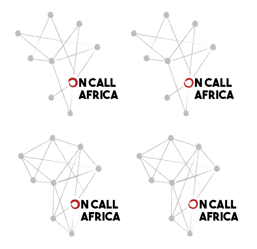
Connections is one of the many important characteristics within this company and that theme should also be shown through their visual identity. This logo is able to get across their truly genuine personality and how they have developed valued connections through their work.
| approach |
The nine dots that make up the continent of Africa also represent the nine villages they work in Zambia. The 9th dot, also the letter O in the name, is the location of where Zambia is located within Africa. What is unique about this logo is the flexibility it can provide for the charity's future plans.
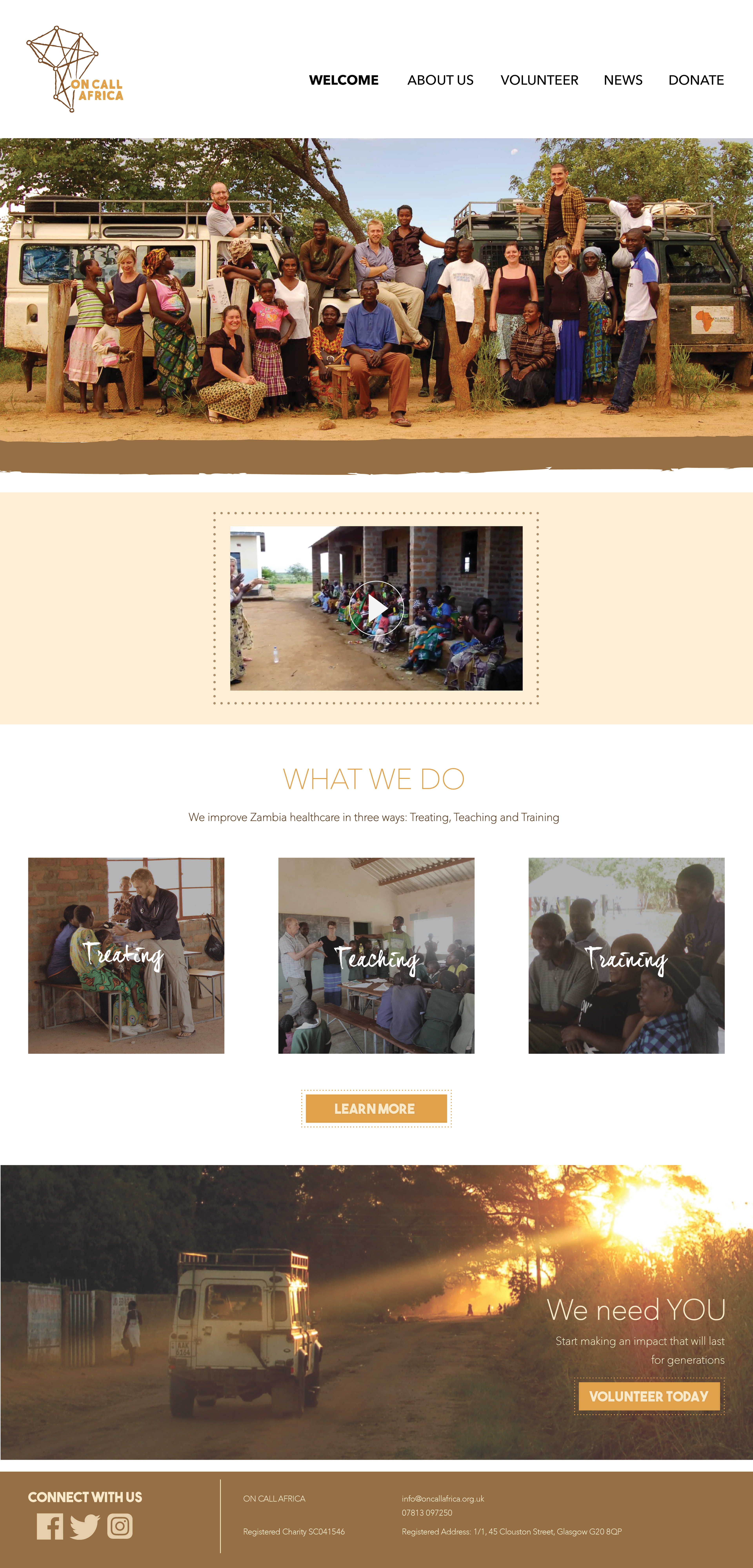
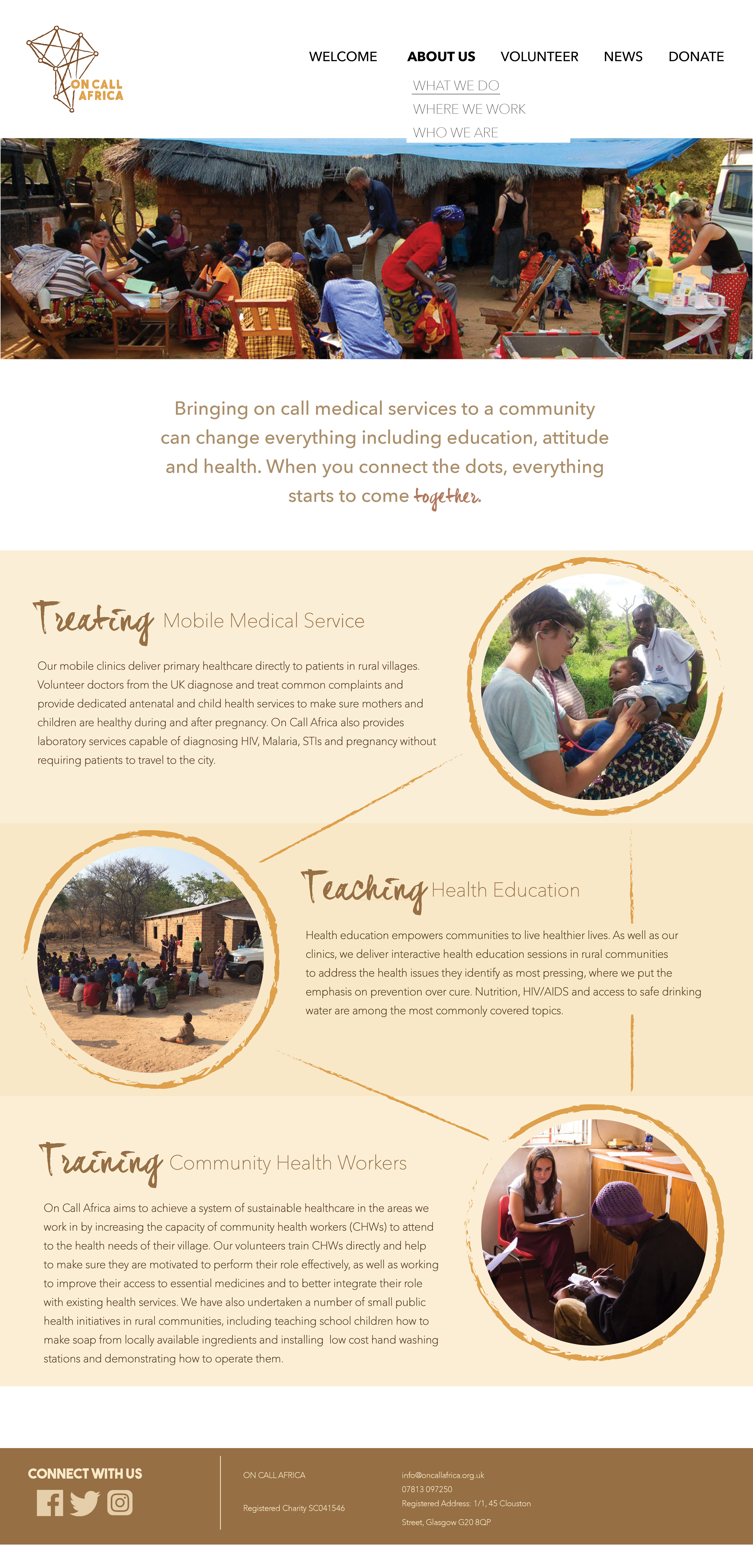
Website Re-design


